Chapter 7 Remote Pilot: Remote Sensing#
1. Introduction#
🛰️ Remote Sensing Overview#
🌍 What Is Remote Sensing?#
Remote sensing refers to the process of collecting information about an object or area from a distance—typically using satellite or aerial technologies—without direct physical contact. It is widely used in environmental monitoring, agriculture, disaster response, urban planning, and more.
Key Features:
Captures electromagnetic data across various spectral bands
Enables monitoring of land, water, vegetation, and urban growth
Essential for environmental and climate research
🌈 Spectral Signatures of Land Use Types in Remote Sensing#
A spectral signature is the unique pattern of reflectance or emittance of an object across different wavelengths of the electromagnetic spectrum. Each material—such as vegetation, water, soil, or urban surfaces—interacts with light differently, producing distinct spectral curves.
Remote sensing instruments capture these patterns, allowing us to identify and classify land cover types based on their spectral behavior.
🏞️ Common Land Use Types and Their Spectral Characteristics#
Land Use Type |
Spectral Signature Characteristics |
|---|---|
Vegetation |
High reflectance in near-infrared (NIR) due to internal leaf structure; low reflectance in visible red due to chlorophyll absorption. |
Water Bodies |
Strong absorption across most wavelengths; very low reflectance, especially in NIR and SWIR bands. |
Bare Soil |
Moderate reflectance across visible and NIR bands; spectral curve varies with moisture, texture, and composition. |
Urban Areas |
High reflectance in visible bands due to concrete, asphalt, and rooftops; spectral response varies with material type. |
Snow/Ice |
High reflectance in visible and NIR; low in thermal infrared due to cold temperatures. |
🎯 Importance in Object Detection#
🔍 Why Spectral Signatures Matter#
Object Identification: Different land cover types can be distinguished based on their spectral curves.
Change Detection: Temporal analysis of spectral signatures helps monitor land use changes, deforestation, urban expansion, etc.
Classification Algorithms: Supervised and unsupervised classification techniques rely on spectral patterns to label pixels.
Vegetation Health Monitoring: NDVI and other indices use spectral bands to assess plant vigor and stress.
Water Quality Assessment: Spectral reflectance can indicate turbidity, chlorophyll concentration, and pollution levels.
🧠 Example: NDVI for Vegetation Detection#
Healthy vegetation: NDVI > 0.6
Sparse vegetation: NDVI ≈ 0.2–0.5
Non-vegetated areas: NDVI < 0.1
🛰️ Summary#
Spectral signatures are foundational to remote sensing analysis. By understanding how different surfaces reflect light, we can:
Accurately map land use and land cover
Monitor environmental changes
Detect and classify objects from satellite or aerial imagery
⚖️ Challenges and Opportunities in Remote Sensing#
🔧 Challenges#
Data Quality & Resolution: Low spatial or temporal resolution can limit accuracy.
Cloud Cover & Atmospheric Interference: Optical sensors struggle in cloudy conditions.
Cost & Accessibility: High-resolution commercial data can be expensive.
Complex Data Interpretation: Requires advanced processing and skilled analysts.
🌟 Opportunities#
Global Coverage: Enables observation of remote or inaccessible regions.
Time-Series Monitoring: Allows tracking changes over time (e.g., deforestation, urban sprawl).
Disaster Management: Useful for early warnings and assessing damage from natural disasters.
Climate Studies: Supports modeling and analysis of climate variables on a planetary scale.
🔍 Types of Sensors Used#
Sensor Type |
Description |
Example Uses |
|---|---|---|
Optical Sensors |
Capture reflected sunlight in visible/NIR bands |
Vegetation, land cover |
Thermal Sensors |
Detect emitted infrared radiation (heat) |
Urban heat islands, wildfires |
Radar Sensors (SAR) |
Active sensors that emit microwaves |
Flood mapping, surface deformation |
Lidar |
Laser-based distance measurements |
Terrain mapping, forest structure |
🚁 Platforms for Remote Sensing#
Platform |
Characteristics |
Use Cases |
|---|---|---|
Satellites |
Global coverage, long-term data collection |
Climate, land use |
Drones (UAVs) |
Flexible, high-resolution data at low altitude |
Precision agriculture, infrastructure inspection |
Aircraft |
Medium-altitude with customizable payloads |
Geological surveys, mapping |
Ground-based |
Stationary or mobile sensors for local data |
Calibration, validation |
📌 Remote sensing is evolving rapidly with advances in AI, cloud computing, and open data sharing—unlocking deeper insights across disciplines.
🌍 Geospatial Analysis Concepts#
2️⃣ Image Composite Analysis#
Definition:
Combining different spectral bands of a multispectral image to create a single visual representation.
Common Types:
True Color Composite – Uses visible bands (RGB)
False Color Composite – Uses infrared or other bands to enhance specific features
Purpose:
Enhances visibility of vegetation, water, soil, etc.
Aids in pattern recognition and terrain classification
3️⃣ NDVI Analysis (Normalized Difference Vegetation Index)#
Formula:
NDVI = (NIR - Red) / (NIR + Red)
Value Range:
+1→ Healthy vegetation0→ Bare soil or sparse vegetation< 0→ Water, snow, or non-vegetative surfaces
Use Cases:
Agriculture monitoring
Forest health assessment
Land cover classification
4️⃣ NDVI Change Detection Visualization#
Goal:
Track vegetation changes over time by comparing NDVI values between different dates.
Steps:
Calculate NDVI for each time period
Subtract past NDVI from present NDVI
Visualize changes using heatmaps or thresholds
Applications:
Seasonal variation analysis
Deforestation or reforestation tracking
Impact assessment of natural disasters
5️⃣ Band Viewer & Thresholding Tool#
Band Viewer:
Allows inspection of individual spectral bands to analyze specific features manually.
Thresholding Tool:
Filters pixel values based on a specified range to isolate features like water, vegetation, or urban areas.
Capabilities:
Interactive sliders for band selection and value thresholds
Dynamic display of filtered regions
Useful for feature detection and classification tasks
Foundational literature#
[de Smith et al., 2024] This book is a cornerstone in the field and covers everything from spatial data modeling to advanced analytical techniques.
2. Simulation#
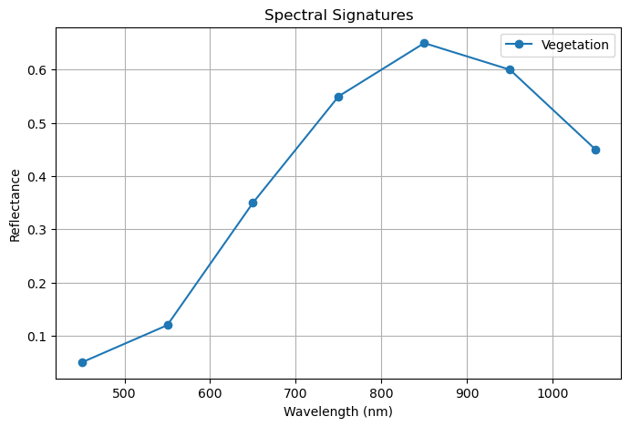
🧪 Interactive Spectral Signature Viewer#
📌 What It Is#
An interactive Jupyter Notebook tool that visualizes spectral reflectance curves of different land use types (e.g., vegetation, water, soil, urban) across wavelengths using ipywidgets and matplotlib.
⚙️ How It Works#
Imports Libraries:
Usesmatplotlibfor plotting andipywidgetsfor dropdown interactivity.Defines Spectral Database:
Reflectance values for each land use type across 7 wavelengths (450–1050 nm).Creates Interactive Widget:
ASelectMultipledropdown allows users to choose which land use types to display.Plots Spectral Signatures:
When selection changes, the corresponding reflectance curves are dynamically plotted.
📥 Input#
User Selection:
One or more land use types (e.g., Vegetation, Water) selected via dropdown widget.
📤 Output#
Reflectance Curve Plot:
A line graph showing how each selected object reflects light across wavelengths.
📊 How to Interpret#
Curve Shape:
Reveals how different surfaces interact with light (e.g., vegetation reflects strongly in NIR).Comparative Analysis:
Helps distinguish land cover types based on their unique spectral patterns.Remote Sensing Insight:
Supports object classification, vegetation health monitoring, and land use mapping.
# 📦 Import required libraries
#pip install streamlit
import matplotlib.pyplot as plt
import ipywidgets as widgets
from IPython.display import display

# 🌱 Sample spectral database (can be replaced with real data or CSV)
spectral_db = {
    "Vegetation": [0.05, 0.12, 0.35, 0.55, 0.65, 0.60, 0.45],
    "Water":      [0.02, 0.03, 0.04, 0.03, 0.02, 0.01, 0.01],
    "Soil":       [0.10, 0.15, 0.20, 0.25, 0.30, 0.28, 0.22],
    "Urban":      [0.20, 0.25, 0.30, 0.35, 0.40, 0.38, 0.35]
}

wavelengths = [450, 550, 650, 750, 850, 950, 1050]  # in nm

# 🎛️ Create interactive widget
object_selector = widgets.SelectMultiple(
    options=list(spectral_db.keys()),
    value=["Vegetation"],
    description='Objects:',
    style={'description_width': 'initial'},
    layout=widgets.Layout(width='50%')
)

# 📊 Plotting function
def plot_spectral_signatures(selected_objects):
    plt.figure(figsize=(8, 5))
    for obj in selected_objects:
        plt.plot(wavelengths, spectral_db[obj], label=obj, marker='o')
    plt.xlabel("Wavelength (nm)")
    plt.ylabel("Reflectance")
    plt.title("Spectral Signatures")
    plt.grid(True)
    plt.legend()
    plt.show()

# 🔁 Link widget to plotting
def on_change(change):
    if change['type'] == 'change' and change['name'] == 'value':
        plot_spectral_signatures(change['new'])

object_selector.observe(on_change)

# 🖥️ Display widget and initial plot
display(object_selector)
plot_spectral_signatures(object_selector.value)
3. Simulation#
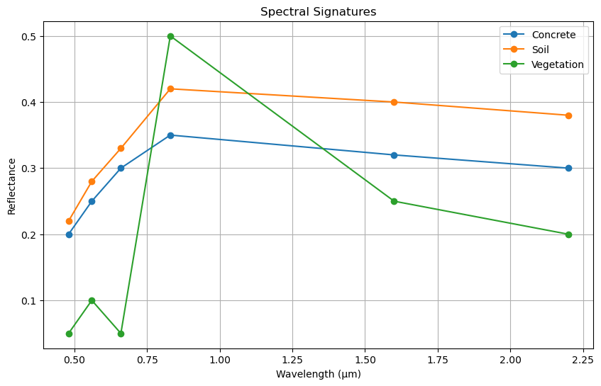
Visualiation of Spectral Signture from Various Landuse#
import numpy as np
import matplotlib.pyplot as plt

# Define wavelengths (in micrometers) commonly used in remote sensing
wavelengths = np.array([0.48, 0.56, 0.66, 0.83, 1.6, 2.2])  # Blue to SWIR bands

# Synthetic reflectance values (scaled 0–1)
concrete = [0.2, 0.25, 0.3, 0.35, 0.32, 0.3]
soil     = [0.22, 0.28, 0.33, 0.42, 0.4, 0.38]
veg      = [0.05, 0.1, 0.05, 0.5, 0.25, 0.2]

# Plotting
plt.figure(figsize=(10, 6))
plt.plot(wavelengths, concrete, label='Concrete', marker='o')
plt.plot(wavelengths, soil, label='Soil', marker='o')
plt.plot(wavelengths, veg, label='Vegetation', marker='o')

plt.xlabel('Wavelength (µm)')
plt.ylabel('Reflectance')
plt.title('Spectral Signatures')
plt.legend()
plt.grid(True)
plt.show()
4. Simulation#
🧬 Multispectral GeoTIFF Combiner#
This script combines multiple single-band GeoTIFF images (e.g., Blue, Green, Red, NIR) into a single multispectral GeoTIFF file.
Inputs:
List of aligned single-band TIFFs (
band1_blue.tif,band2_green.tif, etc.)
Process:
Reads each band as a NumPy array.
Copies metadata from the first band.
Updates metadata to reflect multiple bands.
Writes all bands into a single stacked GeoTIFF.
Output:
multispectral_combined.tifcontaining all input bands.
📦 Useful for remote sensing workflows, image fusion, and false color visualization.
import rasterio
from rasterio.merge import merge
from rasterio.io import MemoryFile
import numpy as np

# 📂 Paths to individual band images (must be same dimensions and aligned)
# band_paths = [
#     "band1_blue.tif",
#     "band2_green.tif",
#     "band3_red.tif",
#     "band4_nir.tif"
# ]

band_paths = [
    "rededge_raw_example3/IMG_0666_1.TIF",
    "rededge_raw_example3/IMG_0666_2.TIF",
    "rededge_raw_example3/IMG_0666_3.TIF",
    "rededge_raw_example3/IMG_0666_4.TIF"
]

# 📥 Read all bands into a list
band_arrays = []
meta = None

for path in band_paths:
    with rasterio.open(path) as src:
        band_arrays.append(src.read(1))  # Read single band
        if meta is None:
            meta = src.meta.copy()  # Use metadata from first band

# 🧭 Update metadata for multispectral output
meta.update({
    "count": len(band_arrays),  # Number of bands
    "dtype": band_arrays[0].dtype,
    "driver": "GTiff"
})

# 📝 Write to a new multispectral TIFF
output_path = "multispectral_combined.tif"
with rasterio.open(output_path, "w", **meta) as dst:
    for i, band in enumerate(band_arrays, start=1):
        dst.write(band, i)

print(f"✅ Multispectral image saved to: {output_path}")
C:\Users\satis\anaconda3\Lib\site-packages\rasterio\__init__.py:368: NotGeoreferencedWarning: Dataset has no geotransform, gcps, or rpcs. The identity matrix will be returned.
  dataset = DatasetReader(path, driver=driver, sharing=sharing, **kwargs)
✅ Multispectral image saved to: multispectral_combined.tif
C:\Users\satis\anaconda3\Lib\site-packages\rasterio\__init__.py:378: NotGeoreferencedWarning: The given matrix is equal to Affine.identity or its flipped counterpart. GDAL may ignore this matrix and save no geotransform without raising an error. This behavior is somewhat driver-specific.
  dataset = writer(
5. Simulation#
🛰️ False Color Composit Visualization#
📌 What It Is#
This Python code is designed for Jupyter Notebook environments and allows users to interactively visualize false-color composites from a multispectral GeoTIFF image using dropdown menus.
⚙️ How It Works#
Imports key libraries: Handles arrays (
numpy), plotting (matplotlib), UI widgets (ipywidgets), image loading (rasterio).Loads a multispectral
.tifimage: Opens the file and reads all spectral bands.Normalizes pixel values: Scales band data to the [0, 1] range for consistent visualization.
Creates dropdown widgets: Lets users select which bands to use for Red, Green, and Blue visualization.
Displays composite image: Combines selected bands and shows them as a false-color RGB image using
matplotlib.
🔍 How to Interpret the Output#
The displayed image reflects a custom RGB combination of spectral bands.
False color helps highlight features not visible in natural color (e.g., vegetation may appear red when using NIR).
Useful for:
🌿 Vegetation health analysis
🏙️ Land use classification
🌍 Remote sensing exploration
import numpy as np
import matplotlib.pyplot as plt
import ipywidgets as widgets
from IPython.display import display
import rasterio

# 📂 Load local multispectral .tif file
# Replace with your actual file path
tif_path = "testdata/rededge_geotiff_example1.tif"

#tif_path = "rededge_geotiff_example3.tif"
with rasterio.open(tif_path) as src:
    bands = src.read()  # shape: (bands, height, width)
    band_count = bands.shape[0]

# 🔧 Normalize bands to [0, 1]
bands = bands.astype(np.float32)
bands /= bands.max()

# 🎛️ Create dropdowns for selecting bands
band_options = {f'Band {i+1}': i for i in range(band_count)}
r_band = widgets.Dropdown(options=band_options, value=0, description='R Band')
g_band = widgets.Dropdown(options=band_options, value=1, description='G Band')
b_band = widgets.Dropdown(options=band_options, value=2, description='B Band')

# 🖼️ Display function
def show_false_color(r_band, g_band, b_band):
    composite = np.stack([
        bands[r_band],
        bands[g_band],
        bands[b_band]
    ], axis=-1)

    plt.figure(figsize=(6, 6))
    plt.imshow(np.clip(composite, 0, 1))
    plt.title(f'False Color Composite\nR=Band {r_band+1}, G=Band {g_band+1}, B=Band {b_band+1}')
    plt.axis('off')
    plt.show()

# 🔄 Interactive display
display(widgets.VBox([r_band, g_band, b_band]))
widgets.interactive_output(show_false_color, {
    'r_band': r_band,
    'g_band': g_band,
    'b_band': b_band
})
6. Simulation#
6.1 Simulation#
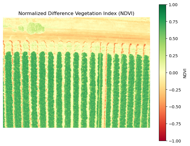
Geospatial Analysis: NDVI Computation from Drone Imagery#
This code calculates the Normalized Difference Vegetation Index (NDVI) using:
Red band:
IMG_0666_3.TIFNear-Infrared (NIR) band:
IMG_0666_4.TIF
📘 NDVI Formula#
🧪 Processing Steps#
Reads Red and NIR bands using
rasterioComputes NDVI and clips values to the range [-1, 1]
Visualizes NDVI using a green-to-red colormap (
RdYlGn)
🎨 Output#
High NDVI (green): Healthy vegetation
Low NDVI (red/yellow): Bare soil, built-up areas, or stressed vegetation
🧠 Student Prompts#
What does a high NDVI value indicate about vegetation health?
How might NDVI vary across different land cover types?
import rasterio
import numpy as np
import matplotlib.pyplot as plt

# 📂 Paths to NIR and Red bands
red_path = "rededge_raw_example3/IMG_0666_3.TIF"  # Red
nir_path = "rededge_raw_example3/IMG_0666_4.TIF"  # NIR

# 📥 Read bands
with rasterio.open(red_path) as red_src, rasterio.open(nir_path) as nir_src:
    red = red_src.read(1).astype("float32")
    nir = nir_src.read(1).astype("float32")

# 🌿 NDVI calculation
ndvi = (nir - red) / (nir + red)
ndvi = np.clip(ndvi, -1, 1)  # Clip values for visualization

# 🎨 Plot NDVI
plt.figure(figsize=(8, 6))
plt.imshow(ndvi, cmap="RdYlGn")
plt.colorbar(label="NDVI")
plt.title("Normalized Difference Vegetation Index (NDVI)")
plt.axis("off")
plt.show()
C:\Users\satis\AppData\Local\Temp\ipykernel_80720\2268034365.py:15: RuntimeWarning: invalid value encountered in divide
  ndvi = (nir - red) / (nir + red)
6.2 Simulation#
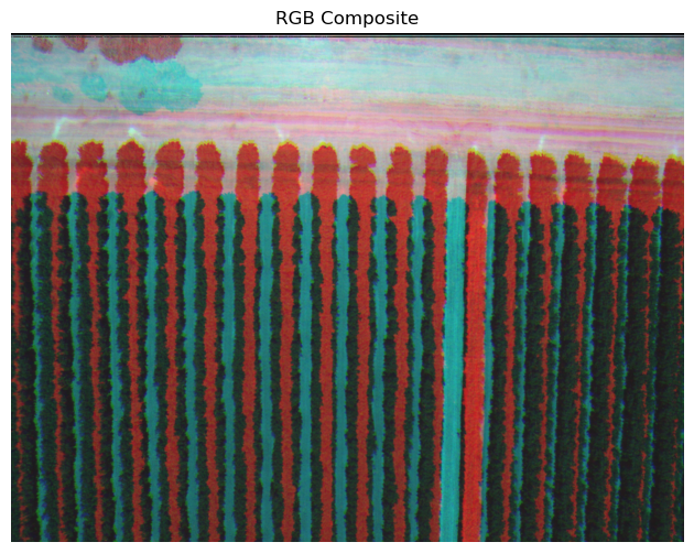
RGB Composite Visualization from Drone Imagery#
This code creates a natural-color RGB image by:
Reading individual Red, Green, and Blue bands from multispectral drone data.
Stacking the bands into a 3D array to form an RGB composite.
Normalizing pixel values for proper display.
Visualizing the result using
matplotlib.
🎨 Output#
Displays a true-color image that resembles what the human eye would see, useful for:
Visual inspection of land cover
Identifying features like vegetation, water, and built-up areas
🧠 Student Prompts#
How does RGB visualization differ from NDVI or NIR-based analysis?
What features are more or less visible in RGB compared to other spectral composites?
# 📂 Paths to RGB bands
red = rasterio.open("rededge_raw_example3/IMG_0666_3.TIF").read(1)
green = rasterio.open("rededge_raw_example3/IMG_0666_2.TIF").read(1)
blue = rasterio.open("rededge_raw_example3/IMG_0666_1.TIF").read(1)

# 🖼️ Stack and normalize
rgb = np.stack([red, green, blue], axis=-1).astype("float32")
rgb /= np.max(rgb)  # Normalize for display

# 🎨 Plot RGB
plt.figure(figsize=(8, 6))
plt.imshow(rgb)
plt.title("RGB Composite")
plt.axis("off")
plt.show()
6.3 Simulation#
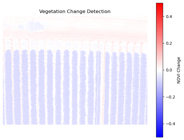
🌿 NDVI Change Detection Visualization#
This code simulates vegetation stress by reducing NDVI values and computes the difference between two NDVI arrays (ndvi1 and ndvi2):
ndvi1: Original NDVI (baseline)ndvi2: Simulated stressed NDVI (10% reduction)change: Difference between the two NDVI arrays
🎨 Output#
Displays a color-coded map of NDVI change using a diverging colormap (bwr), where:
Red indicates a decrease in vegetation health
Blue indicates an increase (if any)
White indicates minimal or no change
🧠 Student Prompts#
What might cause a drop in NDVI in real-world scenarios?
How could this analysis support agricultural or environmental decision-making?
# Assume ndvi1 and ndvi2 are NDVI arrays from two dates
# For demo, simulate change
ndvi1 = ndvi
ndvi2 = ndvi * 0.9  # Simulate stress

change = ndvi2 - ndvi1

# 🎨 Plot change
plt.figure(figsize=(8, 6))
plt.imshow(change, cmap="bwr", vmin=-0.5, vmax=0.5)
plt.colorbar(label="NDVI Change")
plt.title("Vegetation Change Detection")
plt.axis("off")
plt.show()
6.4 Simulation#
Interactive Band Viewer & Thresholding Tool#
This module allows users to:
Select a spectral band (Blue, Green, Red, NIR) from drone imagery.
Apply a threshold to highlight pixels with reflectance values above a chosen level.
Visually compare the raw band and its thresholded mask side-by-side.
🔍 Educational Purpose#
Explore spectral characteristics of different bands.
Understand how thresholding can isolate features like vegetation, water, or built surfaces.
Encourage inquiry into reflectance behavior across multispectral data.
🧠 Student Prompts#
What features become visible at different thresholds?
How does the NIR band differ from visible bands in terms of reflectance?
import rasterio
import numpy as np
import matplotlib.pyplot as plt
import ipywidgets as widgets
from IPython.display import display

# 📂 Paths to bands
band_paths = {
    "Blue (Band 1)": "rededge_raw_example3/IMG_0666_1.TIF",
    "Green (Band 2)": "rededge_raw_example3/IMG_0666_2.TIF",
    "Red (Band 3)": "rededge_raw_example3/IMG_0666_3.TIF",
    "NIR (Band 4)": "rededge_raw_example3/IMG_0666_4.TIF"
}

# 📥 Load bands into dictionary
bands = {}
for name, path in band_paths.items():
    with rasterio.open(path) as src:
        bands[name] = src.read(1).astype("float32")

# 🎛️ Widgets
band_selector = widgets.Dropdown(
    options=list(bands.keys()),
    value="Red (Band 3)",
    description="Band:"
)

threshold_slider = widgets.FloatSlider(
    value=1000,
    min=0,
    max=5000,
    step=50,
    description="Threshold:"
)

def update_plot(band_name, threshold):
    band = bands[band_name]
    mask = band > threshold

    plt.figure(figsize=(10, 5))

    # Original band
    plt.subplot(1, 2, 1)
    plt.imshow(band, cmap="gray")
    plt.title(f"{band_name} - Raw")
    plt.axis("off")

    # Thresholded mask
    plt.subplot(1, 2, 2)
    plt.imshow(mask, cmap="viridis")
    plt.title(f"{band_name} > {threshold}")
    plt.axis("off")

    plt.tight_layout()
    plt.show()

widgets.interact(update_plot, band_name=band_selector, threshold=threshold_slider)
<function __main__.update_plot(band_name, threshold)>
7. Self-Assessment#
📘 Conceptual & Reflective Questions#
Why is band normalization important before visualization?
In what scenarios would false color composites be more informative than true color images?
How does interactive visualization benefit geospatial analysis?
What does the structure
(bands, height, width)imply about image organization?How could this code be expanded to include vegetation indices (e.g., NDVI)?
Q1. What is the purpose of normalizing the bands to the range [0, 1]?#
To reduce the file size of the image
To ensure consistent scaling for visualization and processing
To convert the image into grayscale
To increase the resolution of the image
Q2. What does the function src.read() in Rasterio do?#
Reads the metadata of the file
Loads the pixel values of all bands into a NumPy array
Displays the image on the screen
Converts the file into a different format
Q3. What is the role of widgets.Dropdown in the code?#
To create interactive dropdown menus for selecting bands
To normalize the bands
To display the false color composite
To load the GeoTIFF file
Q4. What does the np.stack function do in show_false_color?#
Combines the selected bands into a single 2D array
Stacks the selected bands along a new axis to create a 3D array
Normalizes the selected bands
Clips the values of the selected bands
Q5. Why is plt.imshow(np.clip(composite, 0, 1)) used?#
To display the image in grayscale
To ensure that pixel values are within the valid range for visualization
To increase resolution
To convert to a NumPy array
Q6. What does the title of the plot indicate?#
Image dimensions
Bands used for the RGB composite
Resolution of the image
File path of the GeoTIFF
Q7. What is the purpose of widgets.interactive_output?#
Display the dropdown menus
Link the dropdown selections to the
show_false_colorfunctionNormalize the bands
Load the GeoTIFF file
Q8. What does the variable band_options represent?#
A dictionary mapping band names to their indices
A list of all pixel values
Normalized values
Image dimensions
Q9. What is the shape of the bands array?#
(height, width)(bands, height, width)(width, height, bands)(bands, width)
Q10. Why is bands.astype(np.float32) used?#
Reduce file size
Ensure format suitable for mathematical operations
Convert to grayscale
Increase resolution
📘 Conceptual Questions: Spectral Signature#
What is a spectral signature, and why is it important in remote sensing?
How do different land use types (e.g., vegetation, water, soil, urban) differ in their reflectance across wavelengths?
Why is near-infrared (NIR) reflectance especially useful for detecting vegetation?
What role does the
SelectMultiplewidget play in the interactivity of the spectral viewer?How does the plotting function dynamically respond to user input in the notebook environment?
🔍 Reflective Questions: Spectral Signature#
How might the spectral signature of vegetation change during drought or seasonal transitions?
What challenges might arise when using spectral signatures to classify mixed land cover areas?
How could this viewer be extended to include real satellite data or CSV uploads?
In what ways does visualizing spectral data help deepen your understanding of remote sensing principles?
How would you modify this tool to support temporal analysis (e.g., comparing signatures across time)?
Multiple Choice#
Q1. Which land use type typically shows high reflectance in the near-infrared band?
A) Water
B) Urban
C) Vegetation
D) Soil
Answer: C) Vegetation
Q2. What does the observe() function do in the context of this notebook?
A) It plots the initial graph.
B) It loads spectral data from a file.
C) It listens for changes in widget selection.
D) It displays the dropdown menu.
Answer: C) It listens for changes in widget selection.
Q3. Which Python library is used for plotting spectral curves?
A) pandas
B) rasterio
C) matplotlib
D) seaborn
Answer: C) matplotlib
True/False#
Q4. The spectral signature of water shows high reflectance in the NIR band.
Answer: False
Q5. The SelectMultiple widget allows users to choose more than one land use type at a time.
Answer: True